KIND Bars Package Redesign
Package Design
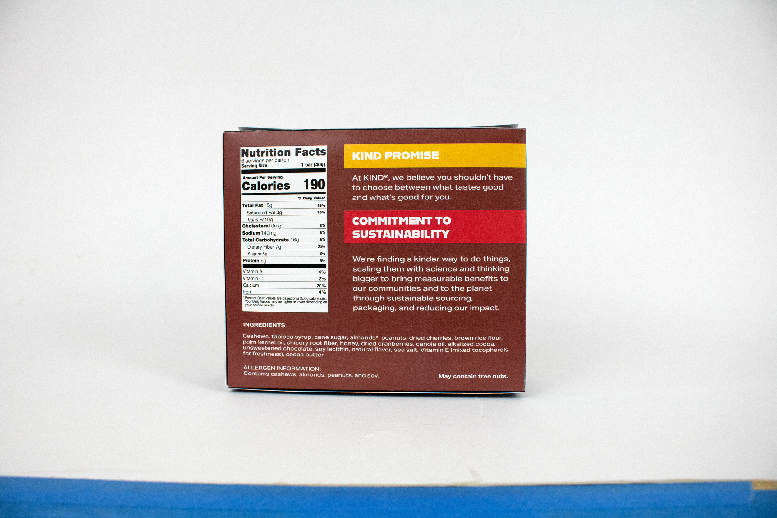
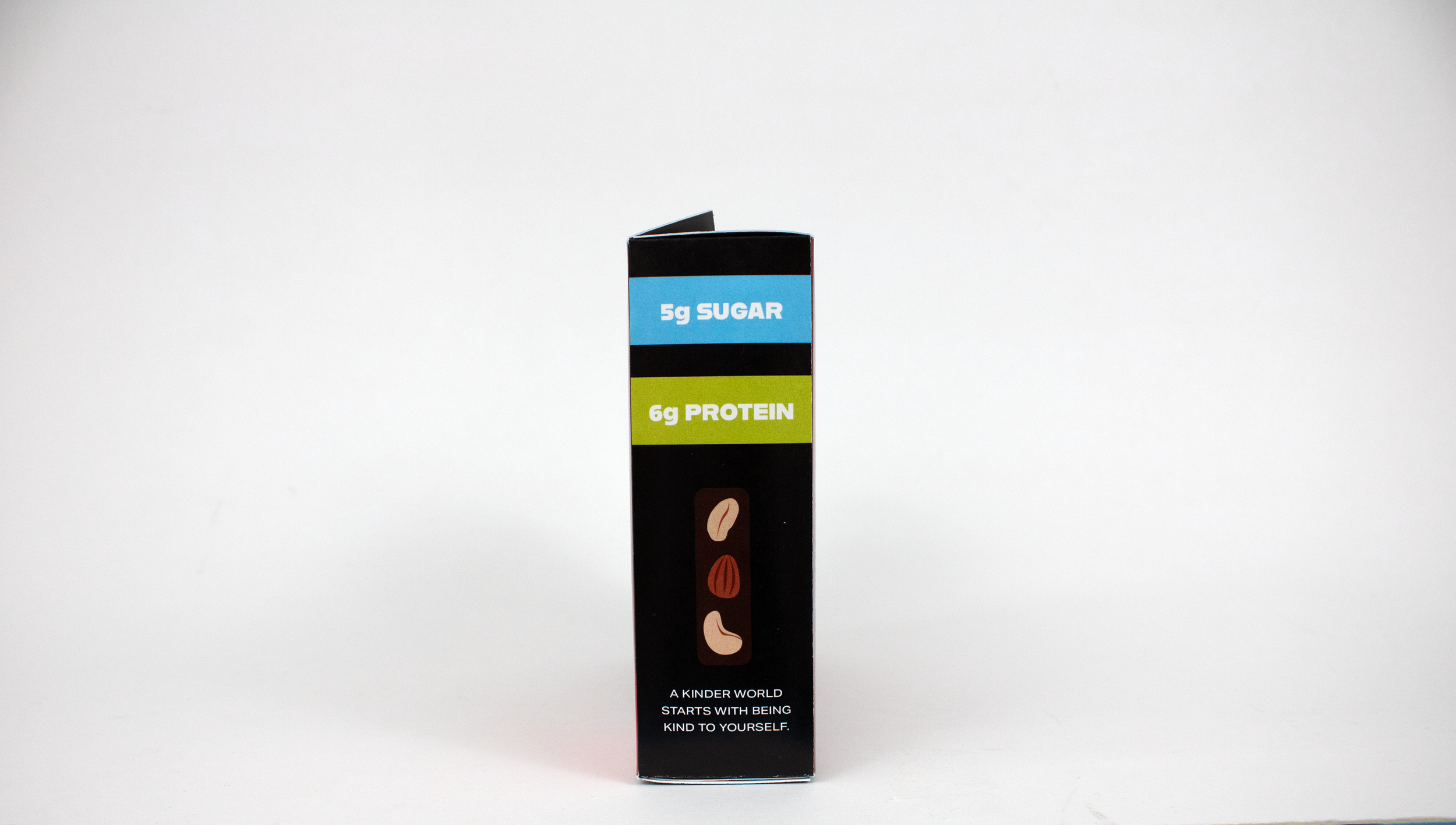
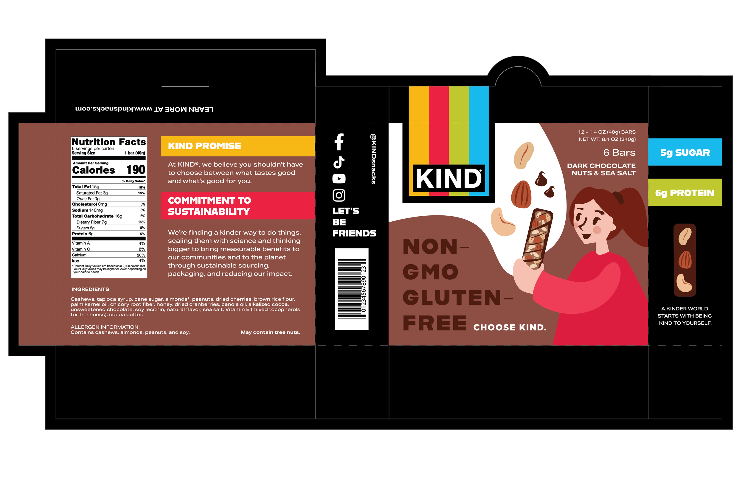
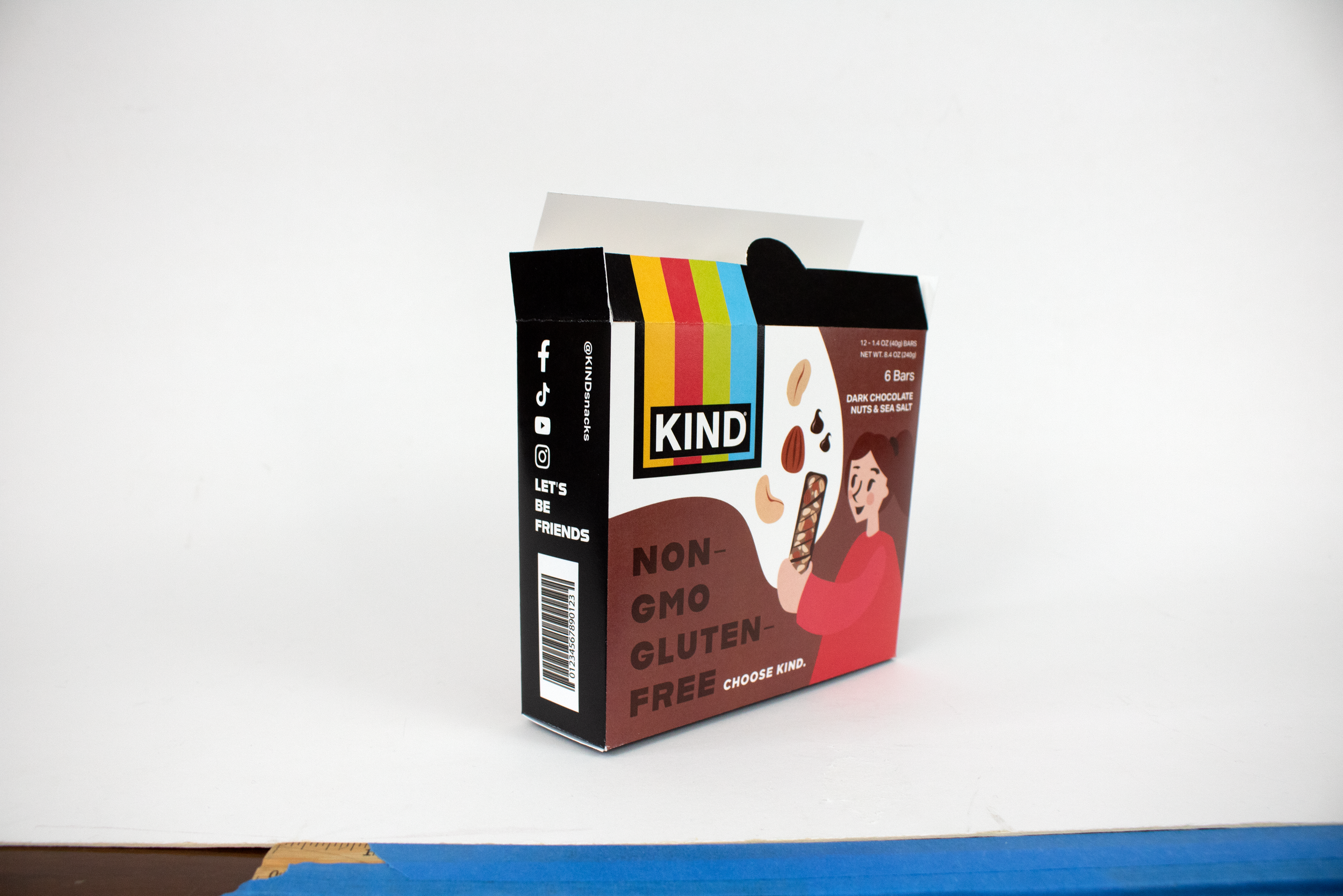
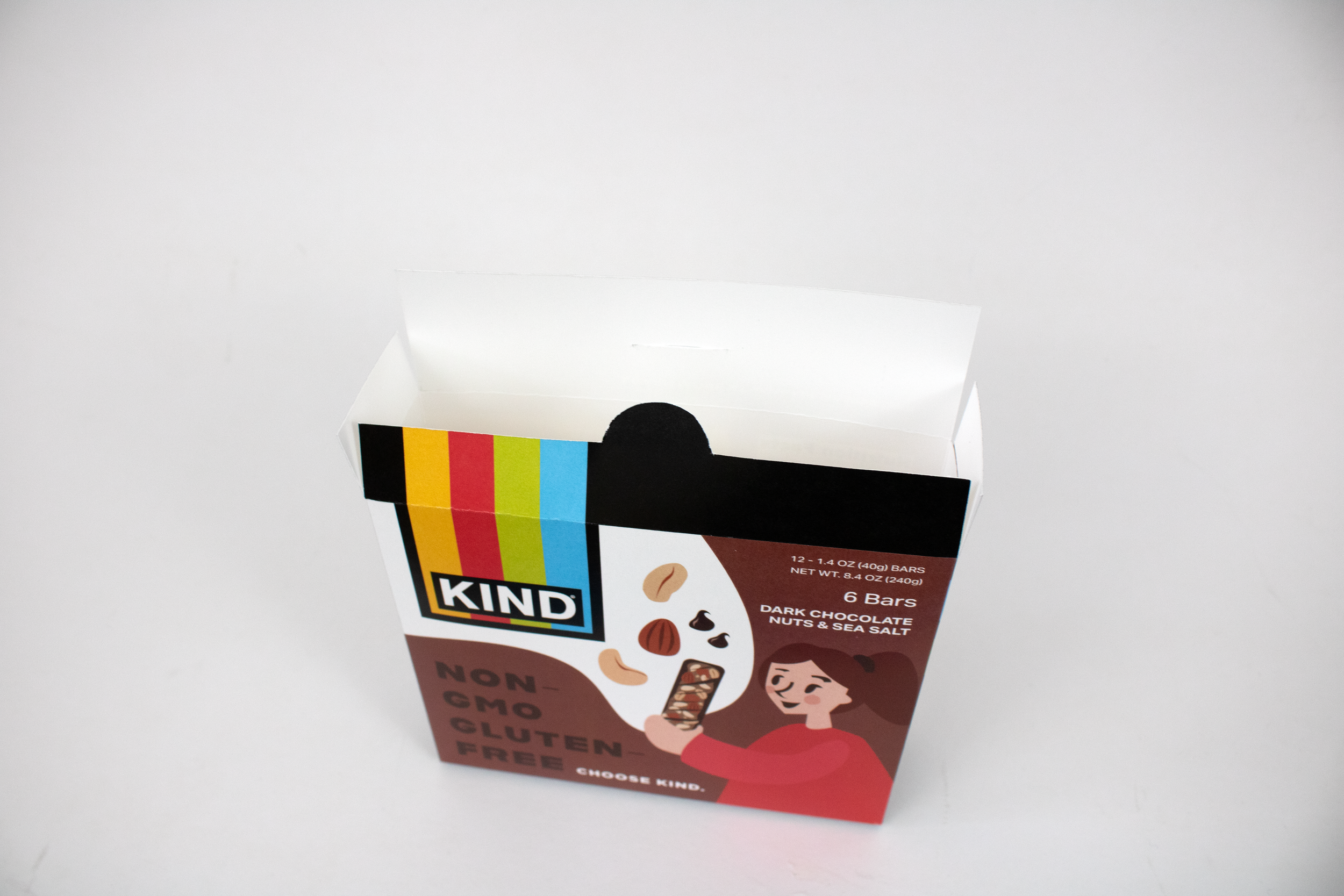
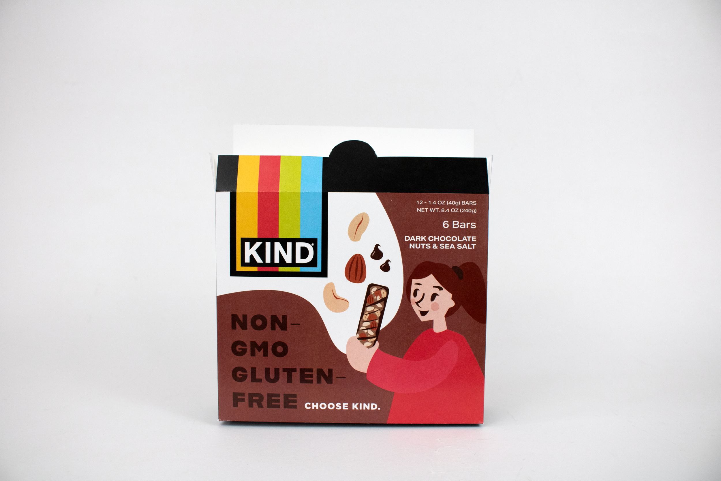
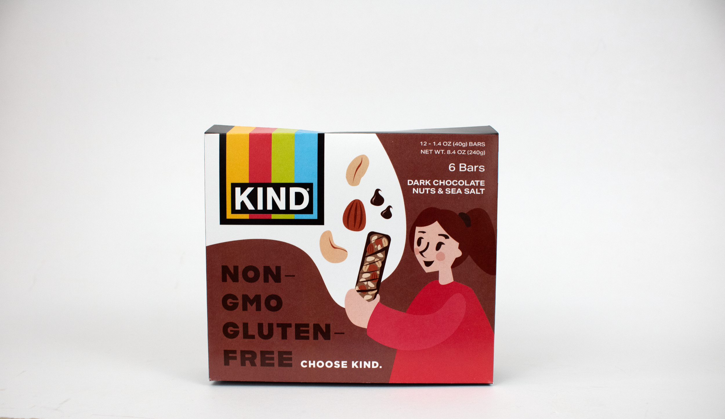
The goal of this redesign is to emphasize KIND’s commitment to sustainability and nourishing ingredients because their current design does not communicate these essential brand values. The goal was to give the packaging a natural feel, but also combine this with KIND’s current bold, bright visual brand. These visual aesthetics are often contradictory, but the challenge was to combine the two to create a cohesive design.
The packaging uses a rich brown instead of the current vibrant teal used for this flavor to give a more natural feel and match the bar flavor. KIND’s bright brand colors were utilized in combination with natural earth tones.
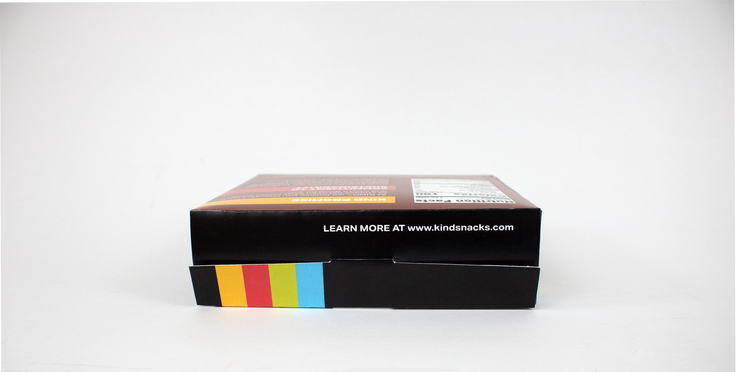
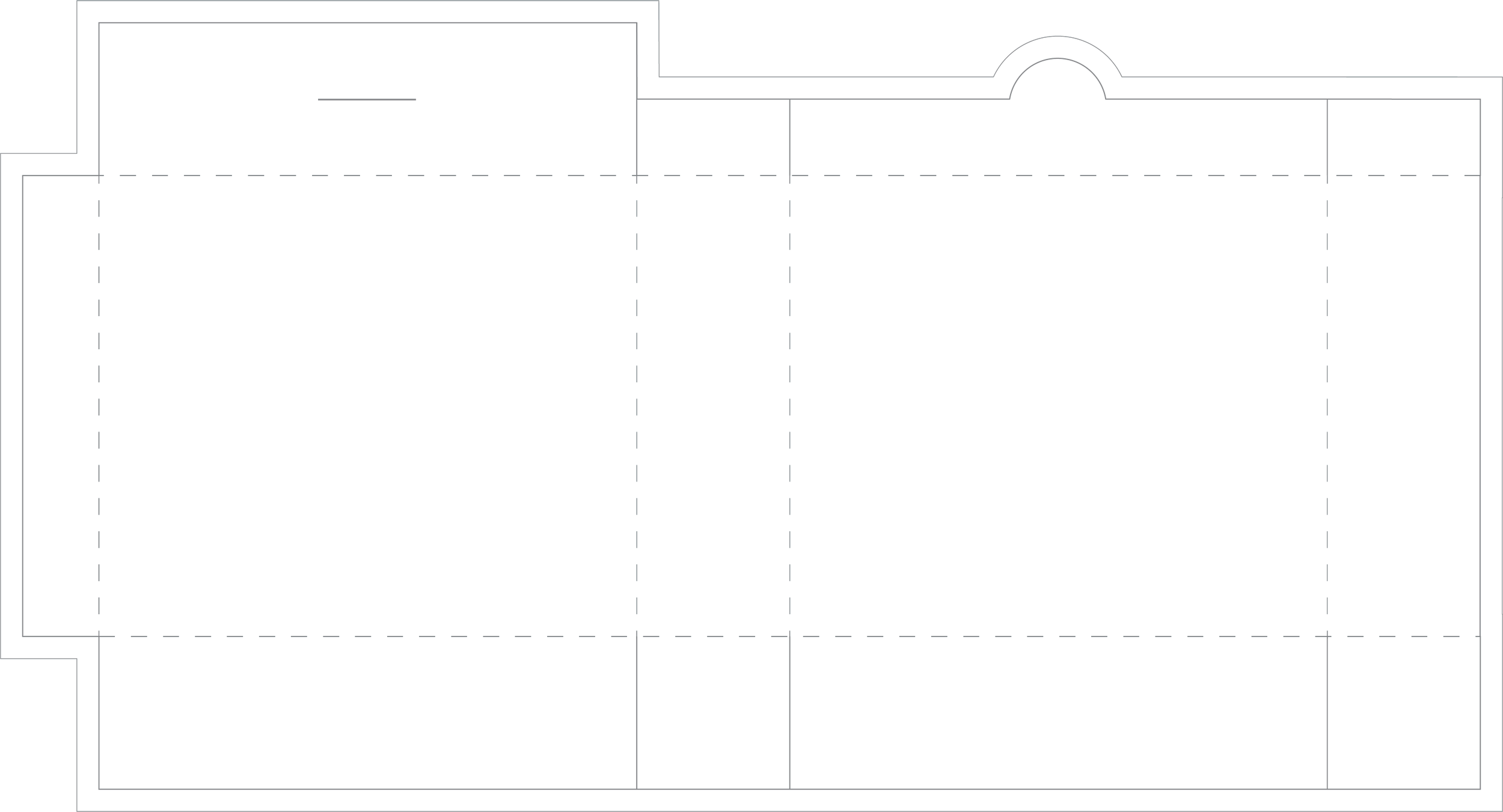
I also made a custom dieline with cut and score lines for this packaging.