Seoul Olympics 2036
Brand Identity, Environmental, Social Media
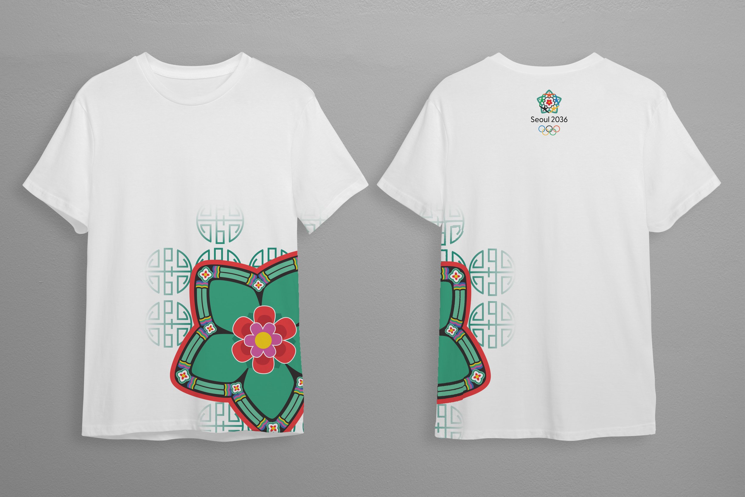
Branding for the Olympic games in Seoul, South Korea. The branding combines the unity and world connection that the Olympics bring with the unique, rich culture of Seoul. The design uses traditional Korean influences, including patterns and motifs especially from Korean Historical architecture, but with a fresh, modern twist.
Deliverables include:
Logo
Poster Series
Ticket Designs
Environmental Graphics
Social Media Campaign
Apparel & Merch


The logo represents the world connection and unity the Olympics bring, as well as the rich culture of Korea. The center flower is the national flower of South Korea, rose of Sharon. Surrounding the flower, abstract representations of figures in the Olympic colors have their arms linked, creating a visual pattern. In the background, a green flower frames the design, inspired by the flowers and vibrant green color of the architecture. Graphic elements were made from expanding upon the original logo shape.


Green is a main color in the branding, drawing inspiration from the vibrant green in the traditional architecture, in addition to other traditional Korean colors as accents. Black is used for the directional signage, making it easily recognizable and visible.